


Dashboards That Change the Game — turning data into decisions, not decoration
If your dashboard looks nice but you still ask “what do we do next?”, it’s decoration. Here’s how to turn dashboards into decision engines — and why one KPI pilot can change your quarter.The problem in one sentence
Organizations flood boards and inboxes with dashboards — then wonder why decisions stall. The root cause is simple: most dashboards show data. The best dashboards change behaviour.
Why decorative dashboards are expensive
When a dashboard fails to direct action, three things happen repeatedly:
- Decisions slow. Teams spend meeting hours arguing definitions instead of deciding direction.
- Confidence erodes. Leaders distrust numbers and revert to gut or opinion.
- Value leaks. Misaligned priorities, duplicated work and missed opportunities compound into measurable cost.
This is not a BI problem — it is a strategy and execution problem.
What “decision-driven” dashboards actually do
Decision-driven dashboards do four things consistently:
- Frame one clear question
Every dashboard should start with a business question (e.g., “Where should we reallocate marketing spend this quarter?”). If the dashboard can’t answer that question in under 5 seconds, it’s not focused. - Show context, then action
Numbers need immediate context (trend, variance, threshold). They must surface the recommended next action, not just the anomaly. - Guarantee trust through lineage
Users must be able to trace any number back to its source and transformation steps. Trust is a byproduct of transparency. - Fit the role, not the analyst
Design for the person making the decision—CFO, head of ops, regional manager—not for the BI team. Different users need different strips of truth, not the same all-purpose dashboard.
A practical framework you can use today (5 steps)
This is the operating playbook Vividx uses to turn dashboards into decision engines.
- Assess (Week 0–1)
Identify 1–2 mission-critical decisions your leadership makes weekly. Map which dashboards currently inform those decisions. - Clarify (Week 1–2)
For each decision, define the single question the dashboard must answer and the acceptable decision window (e.g., 5 seconds; 1 hour; 1 day). - Align (Week 2–4)
Clean the sources that feed those KPIs, assign data owners, and lock an auditable single source of truth for each metric. - Design & Deliver (Week 4–8)
Build focused views that show context + recommended action. Add lineage links and a confidence indicator for each KPI. - Embed & Measure (Ongoing)
Track adoption metrics (usage frequency, decision impact, time-to-decision). Iterate every 30 days based on real behavioural signals.
A short ROI illustration (illustrative)
Estimate the value of one decision accelerated:
- Time saved per decision meeting: 90 minutes → 10 minutes (by having clarity) = 80 minutes saved.
- Value per hour of leadership time (conservative): $200/hour.
- Savings per accelerated decision = $267. If you accelerate 10 such decisions a month, that’s $2,670 — and the operational impact of faster decisions frequently multiplies that number through improved execution and avoided cost.
Use this formula on your key decisions to start quantifying the benefit of better dashboards.
Quick checklist — Is your dashboard decision-ready?
- Does it answer one business question in 5 seconds?
- Can any stakeholder trace a key number to its source?
- Does it include the recommended next action for each flagged item?
- Is there a named owner for the underlying dataset?
- Are you tracking whether decisions changed after the insight surfaced?
If you answered “no” to one or more, your dashboard needs work.
Common pitfalls and how to avoid them
- More KPIs ≠ better decisions. Stop asking “what else can we show?” and start asking “what do we need to decide?”
- Design for action, not aesthetics. Visuals should reduce cognitive effort, not increase it.
- Trust gaps break adoption. Invest in lineage and validation before adding features.
- Lack of ownership kills outcomes. Each critical metric must have a steward with SLA commitments.
How Vividx partners with teams
We combine strategic advisory, data engineering and product-minded UX to deliver dashboards that nudge behaviour and accelerate decisions. Typical engagement includes:
- Executive decision mapping and KPI prioritization
- Source remediation and single-source-of-truth implementation
- Targeted dashboard builds (decision views for 1–3 roles)
- Adoption tracking and iterative optimization
A focused pilot — securing one high-value KPI and proving impact in 30 days — is our recommended first step.
Ready to stop decorating and start deciding?
If your dashboards aren’t driving decisions, you’re paying for wallpaper. Start with one KPI, lock its lineage, design the decision view and measure the result within 30 days.
Request a 30-minute data-to-decision diagnostic at:
vividx.tech/data-diagnostic
Similar publication
 AI in Real Life: Turning Prediction into Progress
Predictive intelligence is only powerful when it drives action. AI forecasts mean nothing if they don’t change behavior. At Vividx,…
Read More Beyond the Creative: The Blueprint for a High-Performance, Data-First Marketing Team
Is your marketing team fueled by intuition or intelligence? In 2026, the gap between creative brilliance and market dominance is…
Read More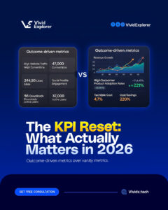 The KPI Reset: Why Your "Success Metrics" Might Be Lying to You in 2026
Is your data telling you the truth, or just what you want to hear? In 2026, many businesses are "rich"…
Read More The Death of the Dashboard: Why 2026 is the Year of Embedded Intelligence
Make Data Invisible, But Omnipresent The most powerful technology is the kind you don't even notice because it’s working for…
Read More