

Why Your Dashboard Isn’t Delivering Real Value (And How to Fix It)
Most dashboards look impressive with colorful charts, slick layouts, and data everywhere. But behind the gloss, many fail to deliver what matters most: actionable insight. In this eye-opening article, Vivid Explorer exposes why most dashboards fall flat and how you can transform yours into a true decision-making powerhouse. From strategy-first design to predictive intelligence, discover the difference between data that just looks good — and data that works.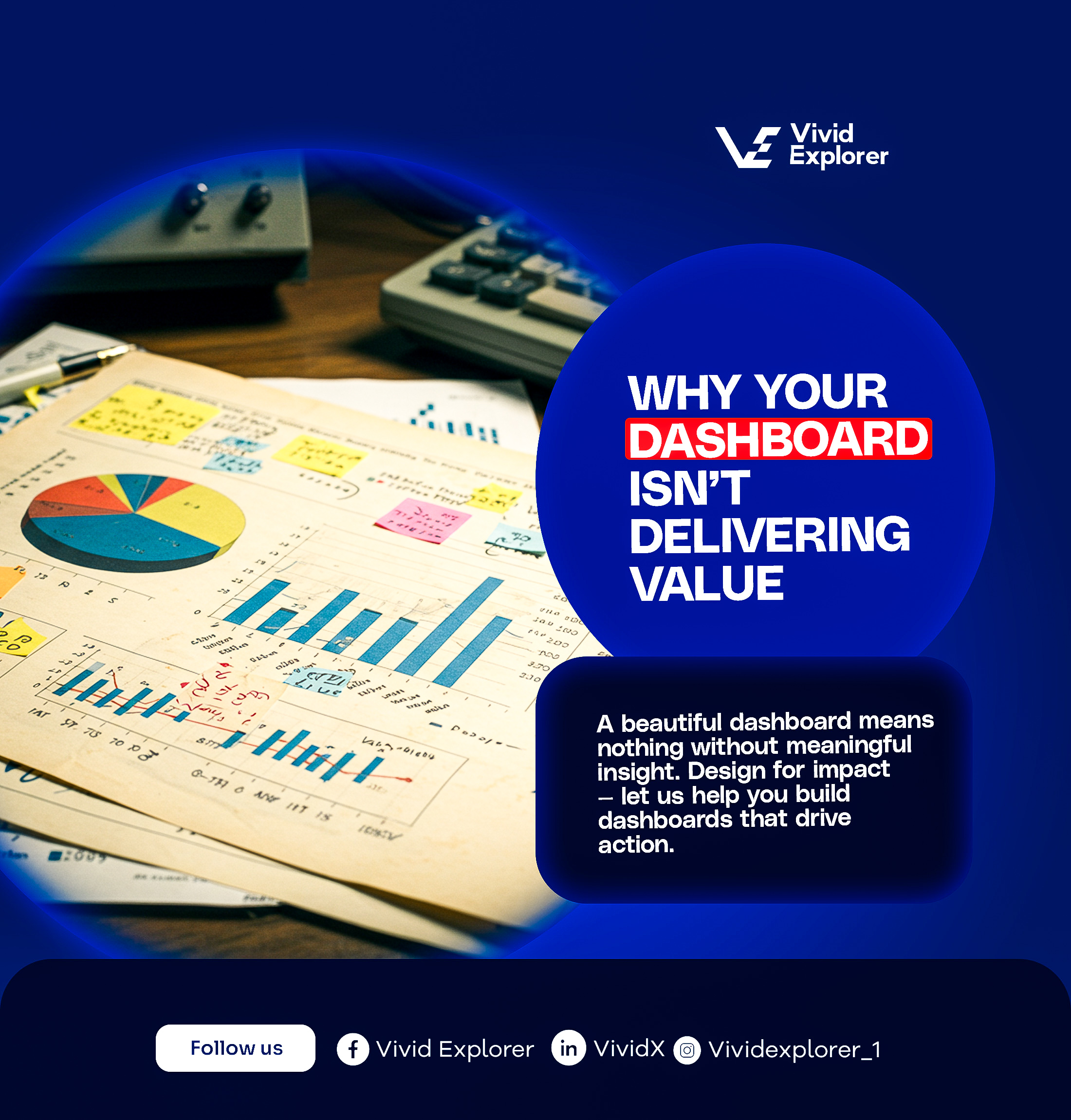
You log in.
You’re greeted by a dashboard full of graphs, charts, and colorful widgets.
It looks impressive. But deep down, you know something’s off.
The insights aren’t clear. The actions aren’t obvious. The impact? Minimal.
Welcome to the illusion of intelligence.
At Vivid Explorer, we’ve seen it too often: businesses proudly displaying dashboards that win design awards, but lose at decision-making.
It’s not about how your dashboard looks. It’s about what it does.
And if it’s not delivering real value, it’s time to fix that — fast.
The Problem Isn’t the Dashboard. It’s the Disconnect.
Let’s cut through the noise. Most dashboards fall short because they weren’t designed to solve problems. They were designed to show data.
Big difference.
Here’s what we’ve found:
Data is there.
Charts are neat.
But insight? Direction? Confidence? Nowhere in sight.
So instead of empowering teams, most dashboards overwhelm them.
Instead of driving clarity, they drown you in clutter.
Instead of guiding strategy, they paralyze decision-making.
If It’s Not Driving Action, It’s Wasting Attention
Ask yourself:
- Does your dashboard instantly spotlight what’s working — and what’s not?
- Can you tell, in 30 seconds, where to pivot?
- Does it guide decisions or just display data?
If the answer is “no” or “not really,” you’re running your business with a blindfold on — just in HD.
Let’s fix that.
How to Fix It: From Data Decoration to Strategic Weapon
Here’s how to turn your underperforming dashboard into a powerful driver of business intelligence.
1. Start With a Question, Not a Chart
The best dashboards don’t begin with “What can we show?”
They begin with:
“What do we need to know to make smarter decisions?”
Every component should answer a specific business question.
If it doesn’t, it’s noise. Strip it away.
2. Build for the Battlefield, Not the Boardroom
Executives, sales teams, customer support — they all need different things.
A real-time dashboard for your frontline team should be fast, focused, and frictionless.
A strategic dashboard for your C-suite should be high-level, predictive, and pattern-rich.
Designing without understanding the user context is like handing a surgeon a paintbrush.
3. Prioritize Outcomes, Not Aesthetics
Nice colors? Great.
Crisp typography? Sure.
But if the dashboard doesn’t lead to actionable outcomes, it’s a vanity project.
Dashboards must show what’s important, in real-time, and trigger the next step — whether that’s a pivot in marketing, a reallocation of resources, or a shift in customer engagement.
Design is not the goal — decision is.
4. Tell a Story — Don't Just Share Data
Raw data is boring.
Even pretty charts can be misleading if they don’t reveal context.
Your dashboard should:
- Highlight anomalies before they become crises
- Reveal relationships between variables you didn’t see
- Frame the narrative: "Here’s what’s happening. Here’s why. Here’s what’s next."
Because numbers alone don’t move people. Stories do.
5. Shift From Reactive to Predictive
Why wait until the end of the month to find out something went wrong?
With the right model, your dashboard can:
- Flag underperformance before it hits
- Predict demand trends before your competitors do
- Reveal customer churn before it’s too late
Real value lies in foresight — not hindsight.
Enter: Vivid Explorer
We built Vivid Explorer (powered by VividX) for one reason:
To help businesses like yours stop guessing — and start moving with clarity.
Our approach combines:
- Business-first thinking
- User-specific dashboard flows
- Predictive data modeling
- Interactive design that invites exploration
- Narrative layering that makes your dashboard tell a story at a glance
Whether you're a fast-growing startup or an enterprise in transformation, we customize dashboards that don't just report — they reveal, predict, and drive decisions.
What Real Value Looks Like
Here’s what happens when your dashboard is done right:
Your team sees issues before they escalate
Your leaders spend less time guessing, more time doing
Your data stops overwhelming — and starts empowering
Your business gets faster, smarter, and more resilient
No more dashboard fatigue. No more guesswork in high-stakes moments.
Just insight. Speed. Strategy.
Ready to Build a Dashboard That Works as Hard as You Do?
If your dashboard doesn’t lead to bold, confident decisions — it’s holding you back.
We’re here to change that.
Let’s build a system that’s not just good-looking — but game-changing.
Gain clarity
Align teams
Drive action
Similar publication
Too many tools, not enough clarity. In the race to become data-driven, businesses often overload themselves with countless platforms, apps, and dashboards — hoping more tools will mean deeper insight. But what they end up with is confusion, redundancy, and decision fatigue. In this blog post, we break down the hidden costs of a bloated tech stack and reveal why simplifying your systems may be the smartest move you’ll make this year. Discover how Vivid Explorer helps forward-thinking teams transform scattered data into smart, unified, and actionable insight that truly drives performance.
Read MoreManual reporting may seem harmless, but it's quietly costing your business time, talent, and momentum. While teams wrestle with spreadsheets and delayed insights, opportunities slip away. In this edition, we explore how forward-thinking businesses are ditching outdated processes and unlocking real-time, automated analytics with Vivid Explorer. Discover how automation empowers smarter decisions, boosts efficiency, and fuels growth — without the guesswork. If you're still spending hours on reports, it's time to make your data work for you.
Read MoreWhat if your dashboard didn’t just show data, but spoke back with insights, predictions, and next steps? At Vivid Explorer, we’re transforming analytics from static visuals into responsive systems that think, guide, and accelerate decision-making. If your dashboard isn’t answering your business questions, it’s not doing enough.
Read MoreReaction Is Slow. Prediction Is Power. In a marketplace moving at lightning speed, companies that only track their past progress are at a disadvantage. The ability to predict future trends and outcomes separates market leaders from the rest. While reactionary strategies rely on hindsight, forward-thinking organizations leverage predictive intelligence to stay ahead of the curve […]
Read More